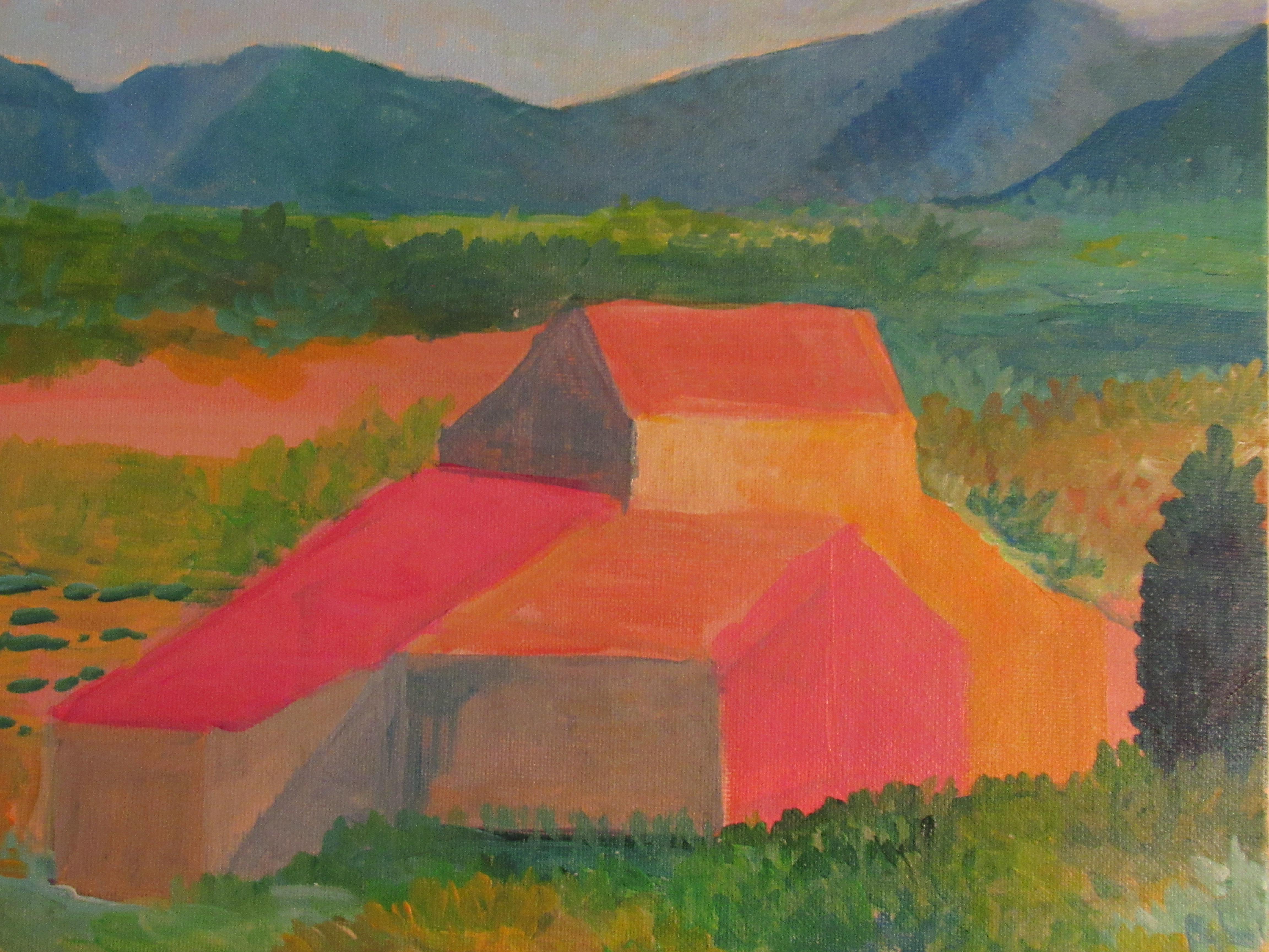
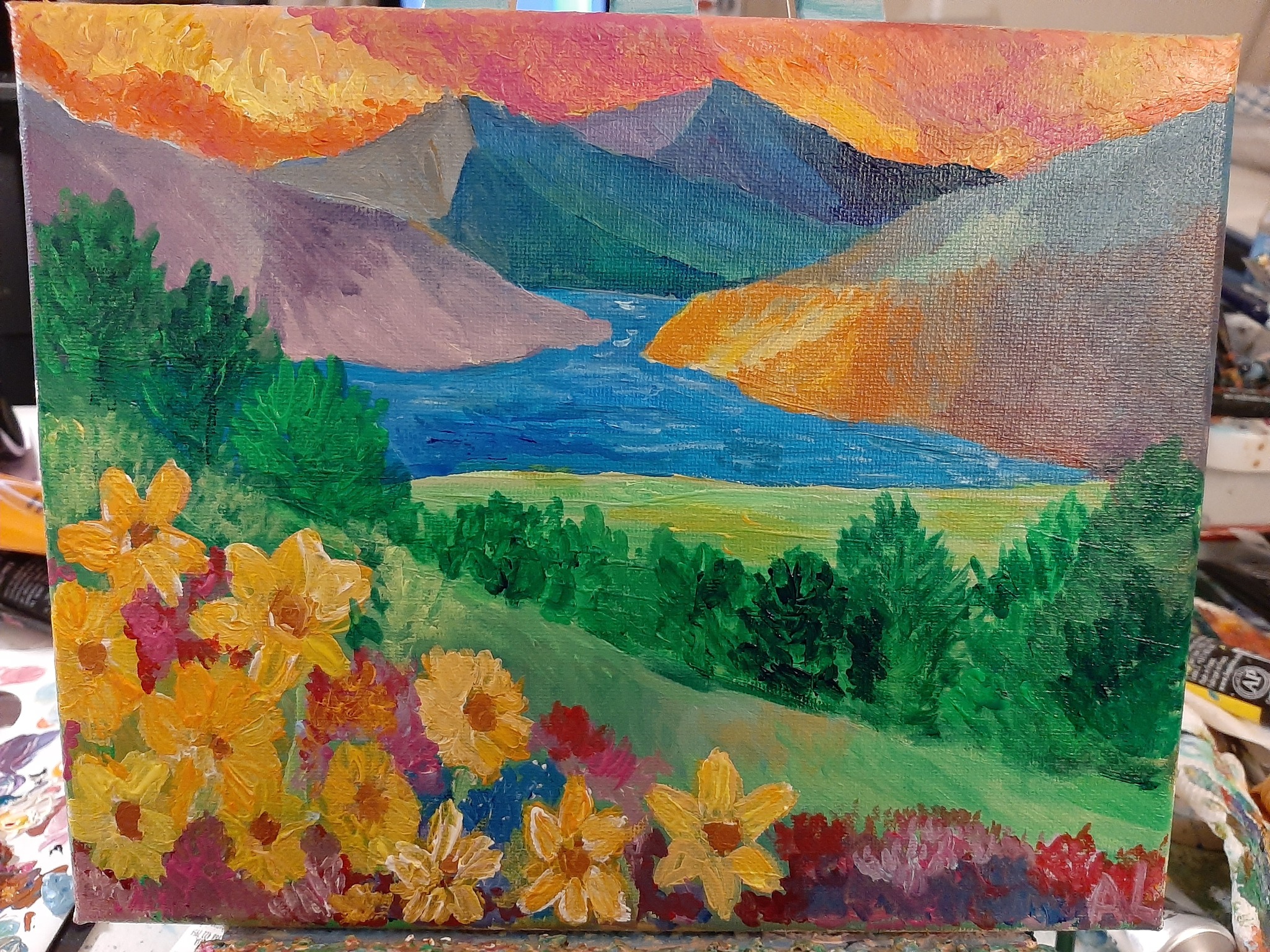
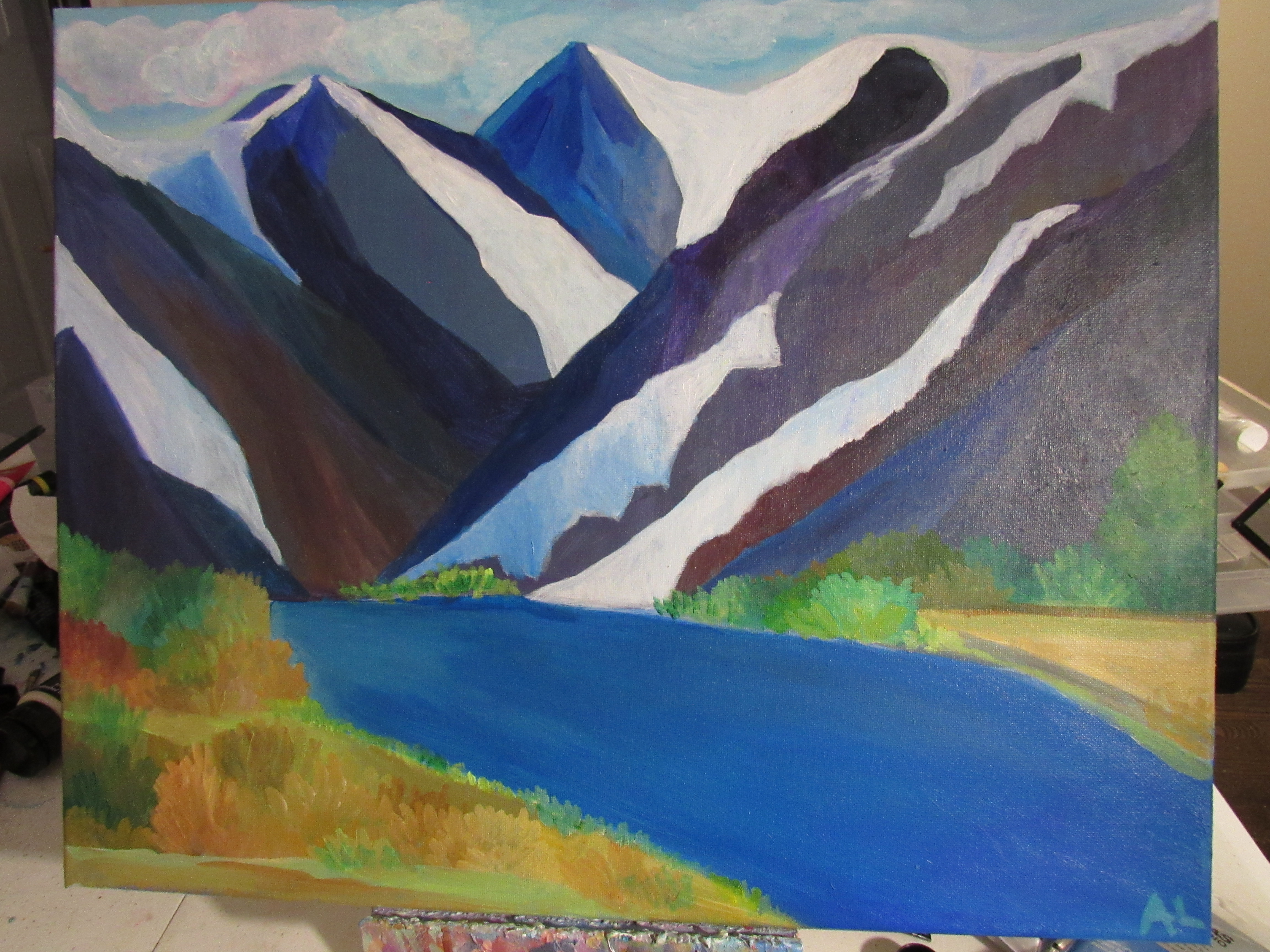
Continuing my theme of ‘Chasing Impressionism’ I enjoyed creating a vibrant Impressionist scene showcasing the majesty of the mountains as spring takes flight.
I named this painting ‘Sisley’s Dream’ as it was loosely inspired by the brushword used by renowned Impressionist Alfred Sisley, although the scene is my unique design. You can purchase the original here or prints here.
I love the way Impressionism allows you to represent the feeling of movement and color in a painting that captures the essence of real life in a tangible way even if it is not strictly realistic.
If you stand in a valley looking at the mountains in the distance you often notice the mix of burnt oranges and yellows coupled with vibrant green grasses and a mix of wildflowers.
At first the landscape may seem dull – if you just notice the burnt browns and yellows and ruddy dirt, but the more you pause and reflect on the nature the more the colors come alive.
My process:
This painting took three hours to complete and was a lot of layering.
The sky is meant to be bold and dramatic, because in the mountains you often witness these ‘God painted skies’ where the sky seems to be on fire with color.
I used a mix of acrylic paints including:
Naples Yellow, Indian Yellow, Burnt and Raw Sienna, White hues, Phthalo Green-Blue, Hookers Green and more.
I don’t use one paint brand religiously but have found my favorite acrylic brands are:
Liquitex Basics or Heavy Body Acrylic
Golden Paints
Sennelier (the paint company used by Monet and Van Gogh) – their Abstract pouring acrylics are great
Lukas
Soho (Jerry’s Artarama Brand)
I do recommend investing in quality (non-student grade) paint because it will be easier to paint with and actually last longer (more bang for your buck) – which is great when you are on a budget (aren’t we all? 🙂 )
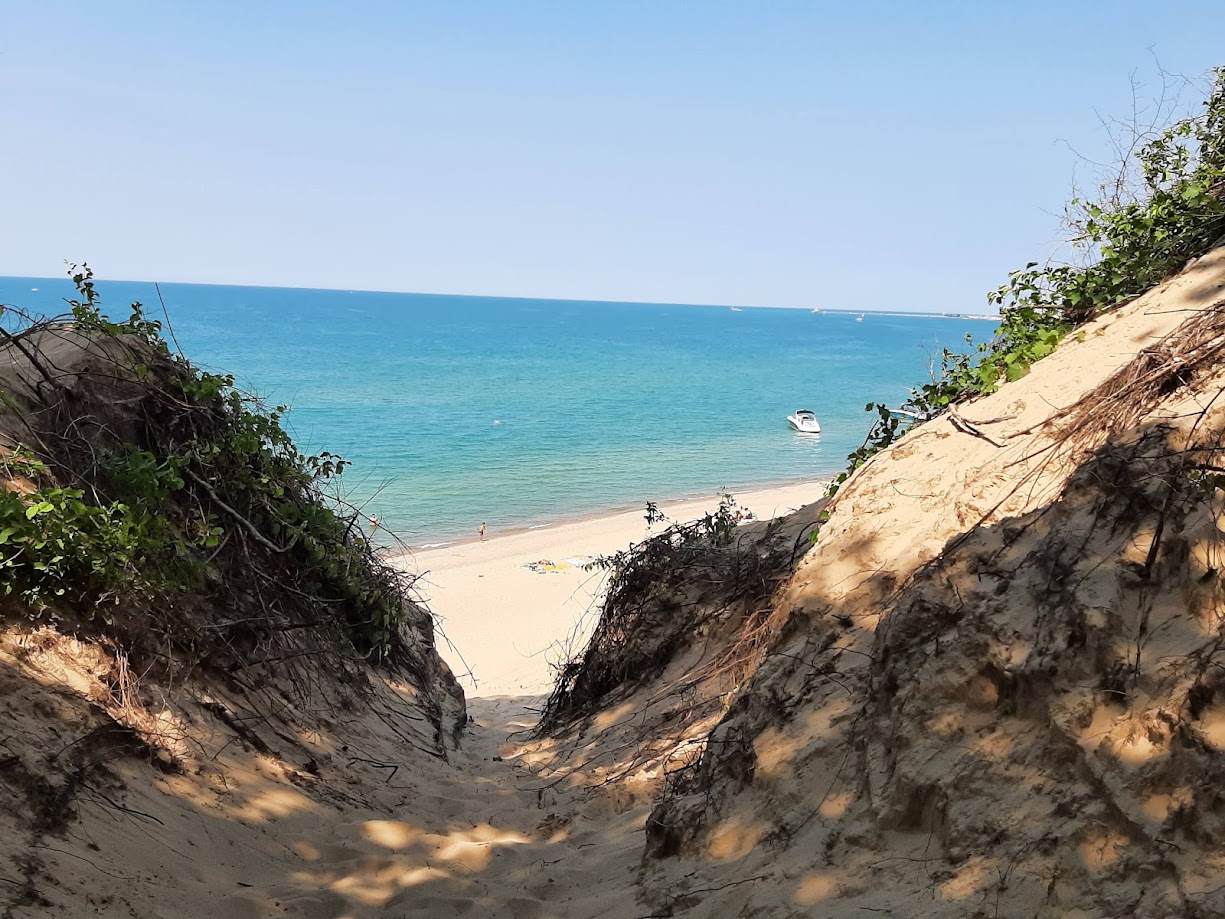
I’m merging my love of Impressionism and our National Parks with my latest 9 x 12 acrylic canvas work…Sleeping Bear Dream…
Inspired by a trip I took to Lake Michigan and Sleeping Bear Dunes in 2021, I sought to capture the formidable windswept dunes and the crystal clear inland sea in this landscape painting.
Lake Michigan is one of the largest lakes of the world and I was stunned at the grandeur of the space. Having grown up near the coast of North Carolina…I’m used to the ocean and dramatic waves, but had never seen a lake so vast.
My process:
I used a mix of unbleached titatanium and raw siena to create the base layer. Acrylic paint works better when you have a base layer of Gesso and other Acrylic paint. Acrylic sticks well to other acrylics, the base layer sets the foundation.
I think worked to build layers of burnt sienna and other ruddy browns and yellows to create the sand dunes. The dunes are pristine, but have layers of driftwood, sandstone and other elements that can create some deeper color constrasts depending on the layer or type of dunes.
I did adjust the reference photo a bit, using my memory with slight imagination to create the coastline.
We had calm waters during our trip, but I studied other photos that included the rough crashing waves against a blue sky.
The painting took about three hours to paint. It was not without frustration…
One tip for any artist, you have to give yourself grace. The middle of the painting can often look terrible – muddy, undefined and you are tempted to give up – but I challenge you to keep adding layers and building out the values and colors. This is part of the process.
Also don’t be afraid to start over on certain sections if it isn’t yielding the initial vision you had. I changed the coastline a bit and am glad I did.
Painting is meant to be fun and it is okay to experiment and take your time.
I invite you to take home this seascape of Lake Michigan…Prints are available here or you can purchase the original on adelelassiterart.com
As I launch my new retail website on adelelassiterart.com (originals and gallery prints) and print on demand site (for mugs, puzzles, totes and more!) I’m excited to debut the first pieces in my new Chasing Impressionism Series…
As an artist I don’t ascribe to one specific style and enjoy learning and growing in my craft across boundaries of ‘style.’
That being said, a part of my heart is love with Impressionism – the bold and bright colors, use of innovative value and perspective – it makes the soul feel alive.
I was recently laid off of my ‘day job’ in software sales and find painting impressionistic scenes to be healing and provide hope in the storm.
I decided to dedicate an entire series to Impressionism. Many of these works are inspired by the talents of my favorite Impressionist and Post-Impressionistic artists like Monet, Hassam, Cezanne, Van Gogh and more…
The original paintings are for sale on adelelassiterart.com…I’m also excited about the print on demand collection because…
Impressionism’s colors are idea for prints and fabrics
Many of my clients don’t have wall space for additional art, but do enjoy a notebook with my art on the cover or a small print for their desktop…
Painting Impressionism…
I was careful to sit and study the art of Monet, Bonnard, Van Gogh and others in detail during my various museum travels. Seeing the art in person helps to learn how artists like Monet were able to capture the light and movement in a scene through brushwork. I can take the lessons from these artists to inspire my own artistic vision on the canvas.
My process:
Many are surprised to learn how long it takes to paint in the Impressionism style. It can appear fluid and effortless to the eye as if it was done ‘in the moment’ as an impression – which at times it is…but truth be told painting in this style takes skill and patience.
The colors need to be properly layered to tell the story and ensure the image shines, but does not blind you with color and imagery.
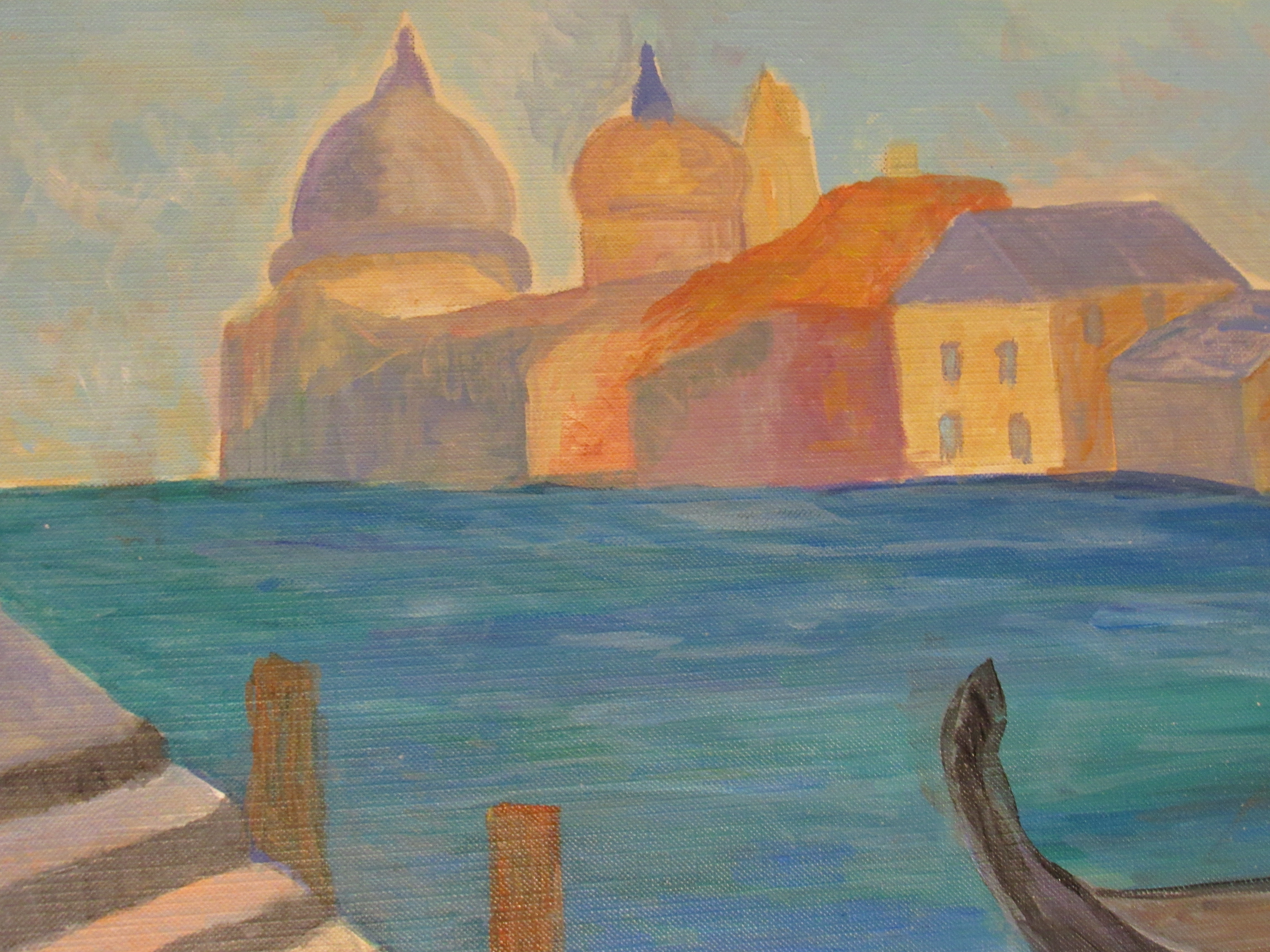
This painting is inspired by a trip I took to Venice – I realized painting the detail of buildings like St. Mark’s Basilica on canvas paper would be difficult and not capture the essence of the city I wanted to convey. I leaned into Monet’s paintings from his one trip to Venice and created my own Venetian dream.
This painting – ‘Chasing Color’ inspired the collection. I studied Bonnard and Monet to create my whimsical vision. Original and prints available on adelelassiterart.com
This painting is modeled after one of my favorite artists – Cezanne! (also my cat’s name) It is not meant to be perfect, but instead capture the light, shadow and color of a landscape. Purchase here.
I also have leaned into Impressionism in this work, where I studied the brushstrokes of Pissarro (his field worker paintings) and developed my own brush style as well.
I look forward to continuing this and my National Parks Collection throughout the spring.
In other news:
I am going to be launching a podcast in April – Art Expeditions (part of my American Nomad Traveler series) – and will dive into the best of art museums and art history. Looking forward to it!
I ask that you please consider purchasing my art. I am leaning into it as my main career right now and every sale makes a difference.
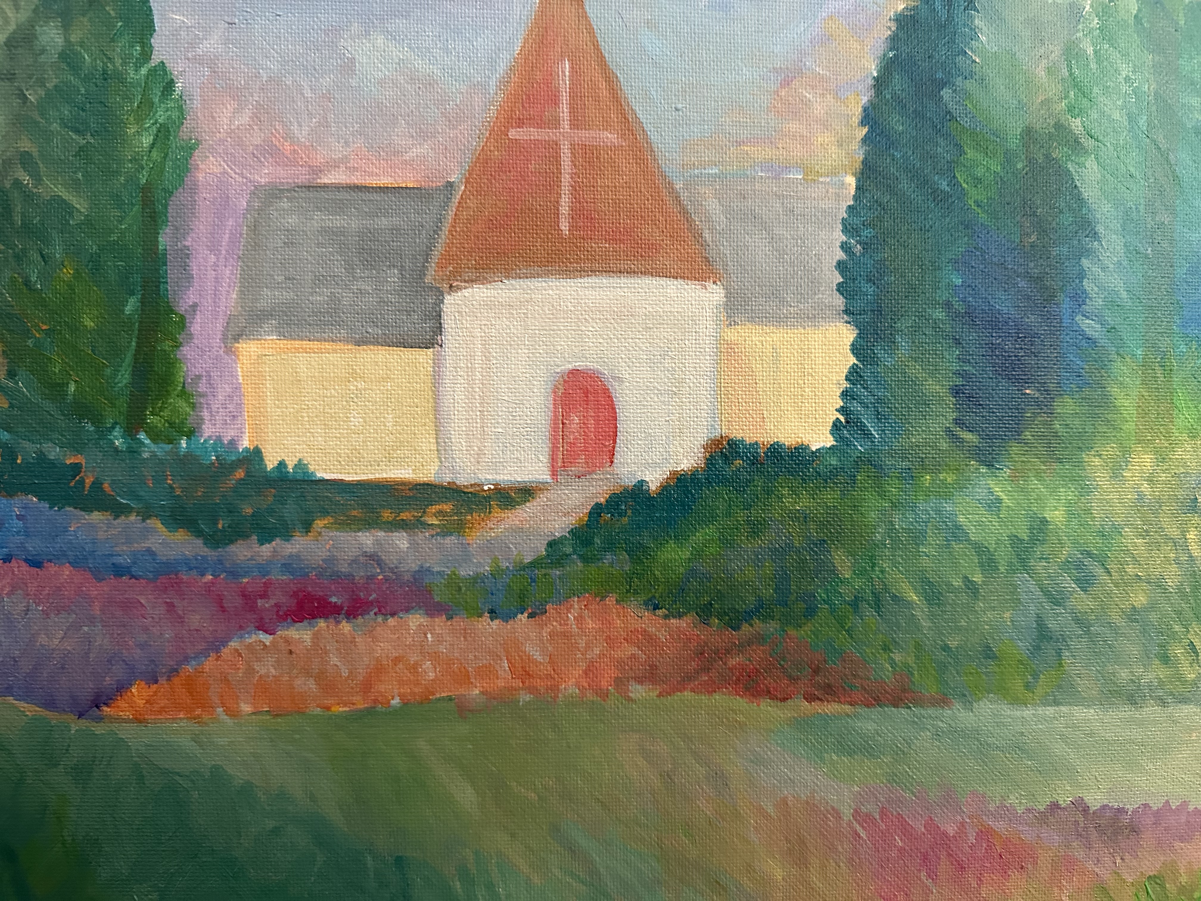
April is one of my favorite times of the year. North Carolina bursts to life with gorgeous flowers and relaxing sunny weather.
I’ve added some new art to my Etsy page and wanted to share a few of the pieces I’ve worked on in the past week!
Old Well at UNC-CH
Please support my art journey by purchasing my work on Etsy – I keep my prices at cost (just covering supplies) because I want to spread hope through art.
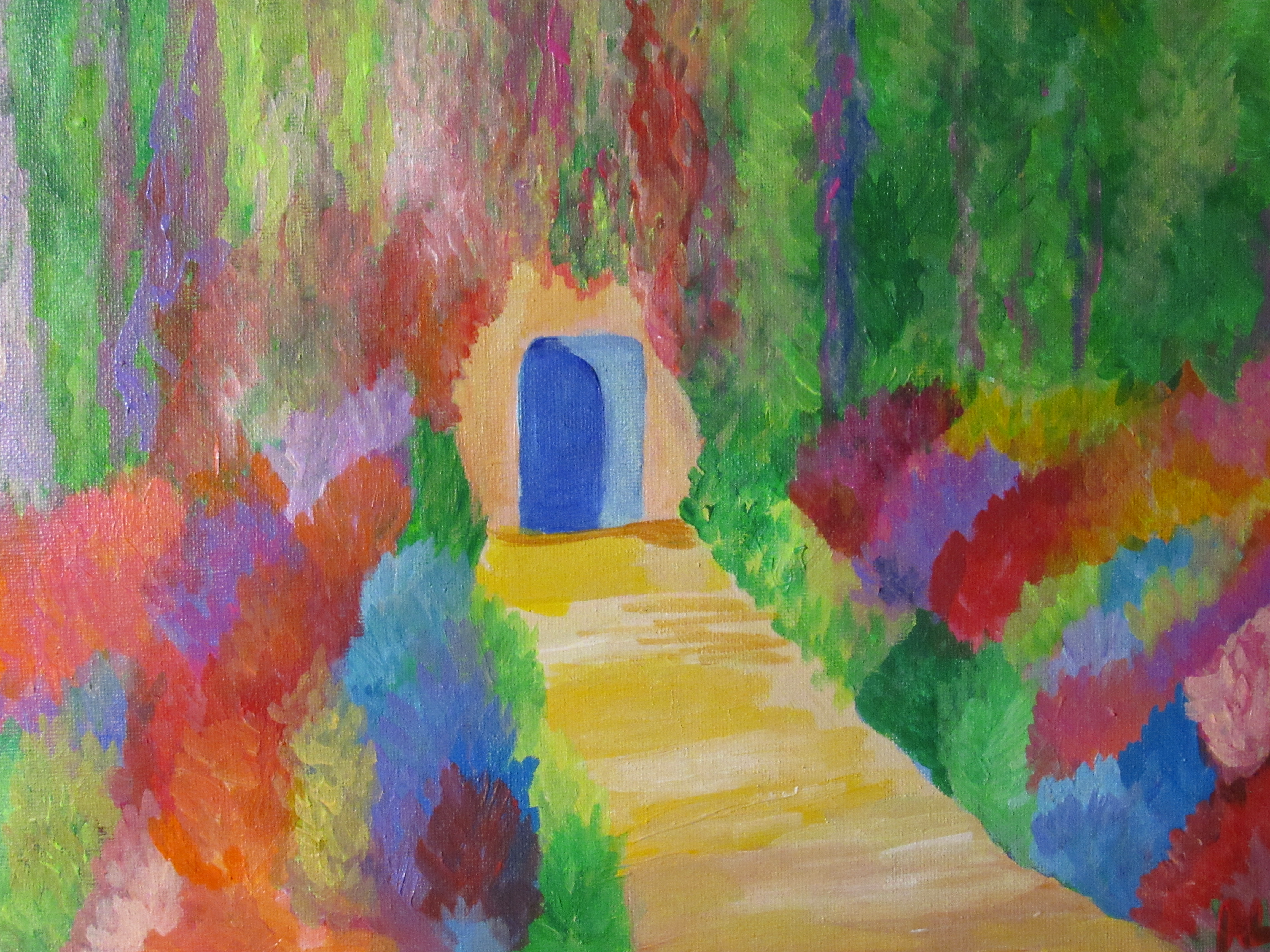
Spring is blooming in North Carolina and I have enjoyed playing with color in a series of impressionist paintings.
I love color and taking time mix colors and build layers upon layer of color.
If you take time to study nature – you’ll notice how the subtle colors of grass against clay and rock is real life impressionism.
As an artist I encourage you to not be boxed in by one style – you can find a style you love and lean into it – but don’t be afraid to try something new or paint in multiple styles depending on your painting mood. I love impressionism and the spring colors have me playing homage to Monet and fauvism (Matisse) – but I also enjoy taking time to learn how to build deep realistic paintings.
Whether I’m focusing on creating a realistic interpretation or impressionism/abstract style – I always lean into value.
Value defines how light or dark a given color or hue can be. Values are best understood when visualized as a scale or gradient, from dark to light. The more tonal variants in an image, the lower the contrast. When shades of similar value are used together, they also create a low contrast image
Value is all around us – and I encourage you to observe and take notice of different contrasts of light and dark and how colors appear in nature. Sometimes I paint something that seems counterintuitive to what I would assume because the reference photo has a different value. ex: I know the mountains are grey and green – but they appear blue so I paint a cool blue based on the value and representation of color in the photo.
Once you start studying value – you are also able to ‘auto-correct’ as needed based on the science of value. Ex: establishing where your light source is helps you to identify hw to build shadow and contrast in the image.
Ricky Allman does a great job explaining value and painting to value in his Great Courses class. You can sign up for a trial and He is AMAZING.
I always try to paint to the value – whether I’m being ‘wonky’ and colorful with impressionism or painting realistically because it helps to establish cohesive and attractive paintings/art.
Whether you are a seasoned artist or getting into painting for the first time – making sure you have the best supplies to empower your art is important.
I’ve been actively painting with acrylics for about five years – and painting regularly (3 times a week) since the pandemic hit. I wanted to share lessons I’ve learned along the way.
It is important to recognize that art is a journey and while you can master certain techniques – artists are always learning and growing. We can develop unique styles and master regimens, but the best artists are always open to growth. Masters like Monet, Van Gogh and beyond – learned from making mistakes and developing their craft.
The most unique artists I’ve studied (including modern masters and YouTube experts) studied other artists and practiced techniques from past ‘masters’ to learn technique and open their vision from paint to palette.
The point – don’t be afraid to try different styles of art and take a tutorial on how ‘Van Gogh’ painted – creativity is part orignality and part collaboration. You can learn a lot through online tutorials or putting your own spin on historical paintings (just reference the original artist when you are done). Ginger Cook (YouTube Acrylic Teacher ) has a great series of how to paint the masters on her channel.
Also don’t be afraid to test out different styles of art. I personally love to paint landscapes, but recently I’ve tackled abstracts. Within my landscape portfolio I try different views on the same landscape – from impressionism to abstract to expressionism. Sometimes I fail and it’s okay – it is only paint! You can paint over a canvas if you mess up! I always learn more from mistakes than successes in painting. Work with the process.
I work fulltime in software sales – but art is my passion. I try to block out time to paint daily – but let’s face it – life happens. So what I recommend is blocking off your calendar for daily ‘art’ time – even if it is watch a tutorial or combing through an art book.
Notice your surroundings – how light touches trees at different times of the day…how shadows and light play together in regular daily settings. Observing light and values in day to day life will help you become a better artist
Invest in materials
The biggest advice I can give from my experience in art is it is worth investing in quality supplies – especially if you are a beginner. While the buy one = get ten free sales at Michael’s on student paint seems tempting – in the end you will waste time and money by ‘saving’ cost upfront on student paints.
Why? I used to buy fifty paintbrushes for $10 on sale -but they were impossible to paint with. I had to use tons of extra paint to get it to stick to the canvas – not to mention tons of paint hairs would wind up on the canvas stuck in the paint.
Cheap canvas? They can be redeemed with gesso but a cheap and ineffective canvas can be like sandpaper on your brushes…unable to keep paint on the canvas and leaving blotchy spots.
Gesso can help with this to provide better binding – but if possible invest in quality affordable canvas.
Paints – while there are some decent student grade paints -most are watered down and have less pigment so you end up using a tube of paint just to finish a painting. The mixing quality isn’t as good.
I’ve tried lots of different paints, brushes and supplies over my art journey and continue to test new products. The standbys I always invest in are listed below – they provide the best value for the investment and help me to provide the best art to my clients and continue to improve as a painter.
Acrylic Paints:
I recommend investing in your primary colors first and then adding on specific specialized colors that are harder to mix (magenta, dioxinade purple, etc…)
Invest in a color wheel and mixing guide so you can make more colors from less tubes of paint.
Golden: I love Golden Paints – their heavy body paint is thick and easy to blend and spread. Golden is my go to for specific colors like ‘Light Phthalo Blue.’ I love this color because it provides an ideal sky blue or is a good blending blue. I spend $20.00 a month on this color – but it is worth it!
Liquitex: Liquitex Basics is an awesome quality starter paint that I continue to use 90% of the time. Liquitex also has professional series from soft body and heavy body paints. The heavy body is great for thicker landscape/strokes and the softbody is good when you want a more flowing stroke (from my use anyway 🙂 Liquitex also has great glazing and acrylic additives.
Soho – Jerry’s Artarama brand – I use it for primary colors – quality affordable paint
Lukas – I like their blues and yellows – good price and quality paint
Sennelier – this is a favorite of paintings – Van Gogh and Monet used Sennelier paints for oils. Their Abstract paint is great for mixed media!
Brushes:
I spend a lot on brushes and have also saved a ton of money and time by doing so. A quality brush is essential to painting – from beginners to professionals.
I recommend Silver Brushes – they are my absolute favorite – especially Ruby Satin.
However, I also supplement with Soho (Jerry’s Artarama), Princeton and Raphael
March is one of my favorite months of the year – changing of the seasons, gorgeous blooms (or winter freezes depending on your location) – college basketball…(Go Heels)
I’ve been spending March digging into painting – I’ve been painting daily and working on building my art business.
I am also working on some creative writing that will launch on Adele Lassiter Creative soon (Icing on the Cupcake series)
I wanted to take some time to update the blog with pieces from my latest collection.
I appreciate the support as I continue to build my creative business.
To thank you I am offering Adele Lassiter Creative fans a 20% discount to my Etsy shop. Redeem here
This spring I am continuing my ‘Painting the National Parks’ collection as well as adding in fun floral prints and abstracts. Fresh art is being added to Etsy weekly.
Please support a working artis by purchasing through Etsy or via direct message.
My goal is create beautiful, fun and relaxing art that is affordable and accessible to art lovers.
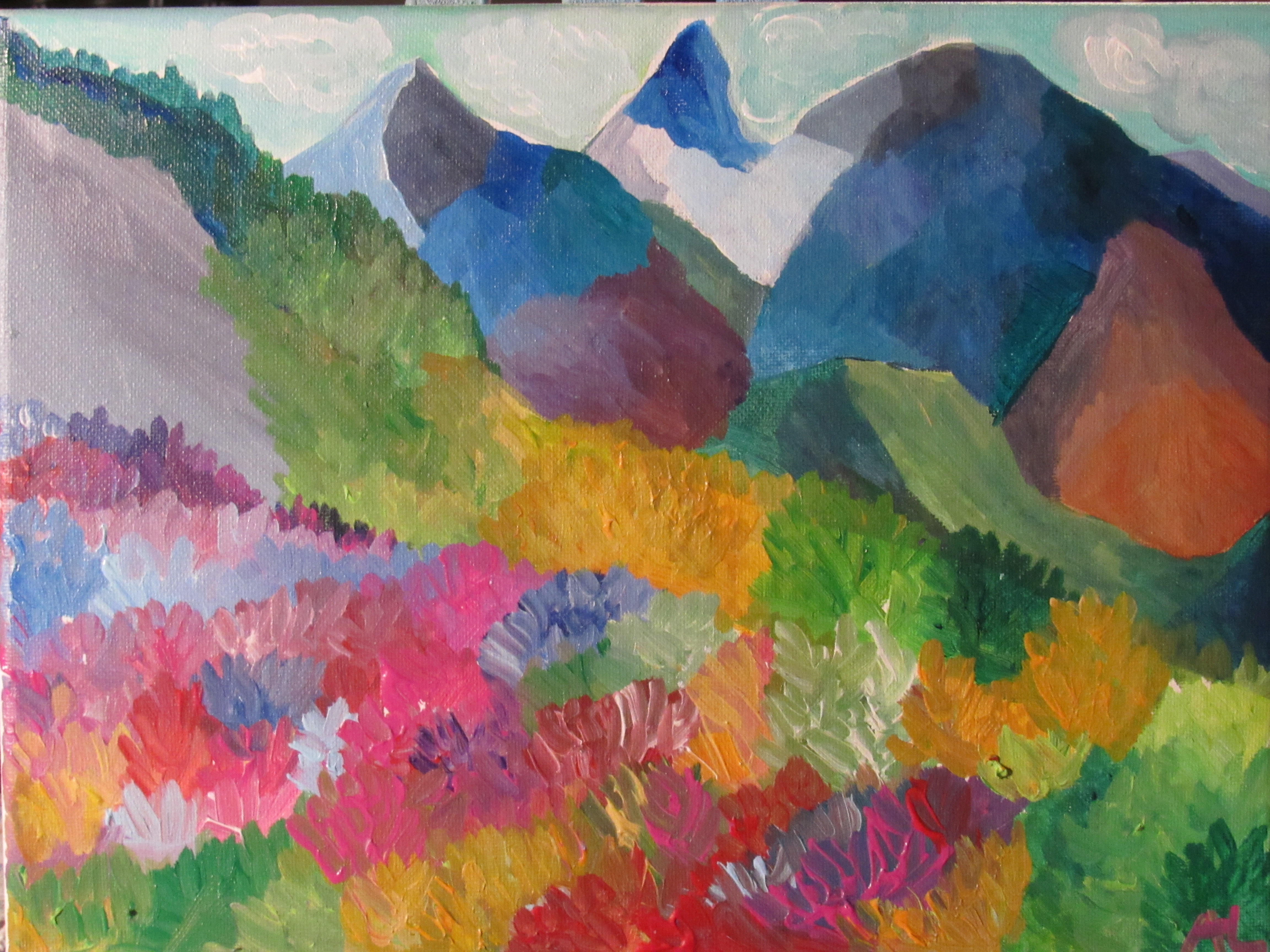
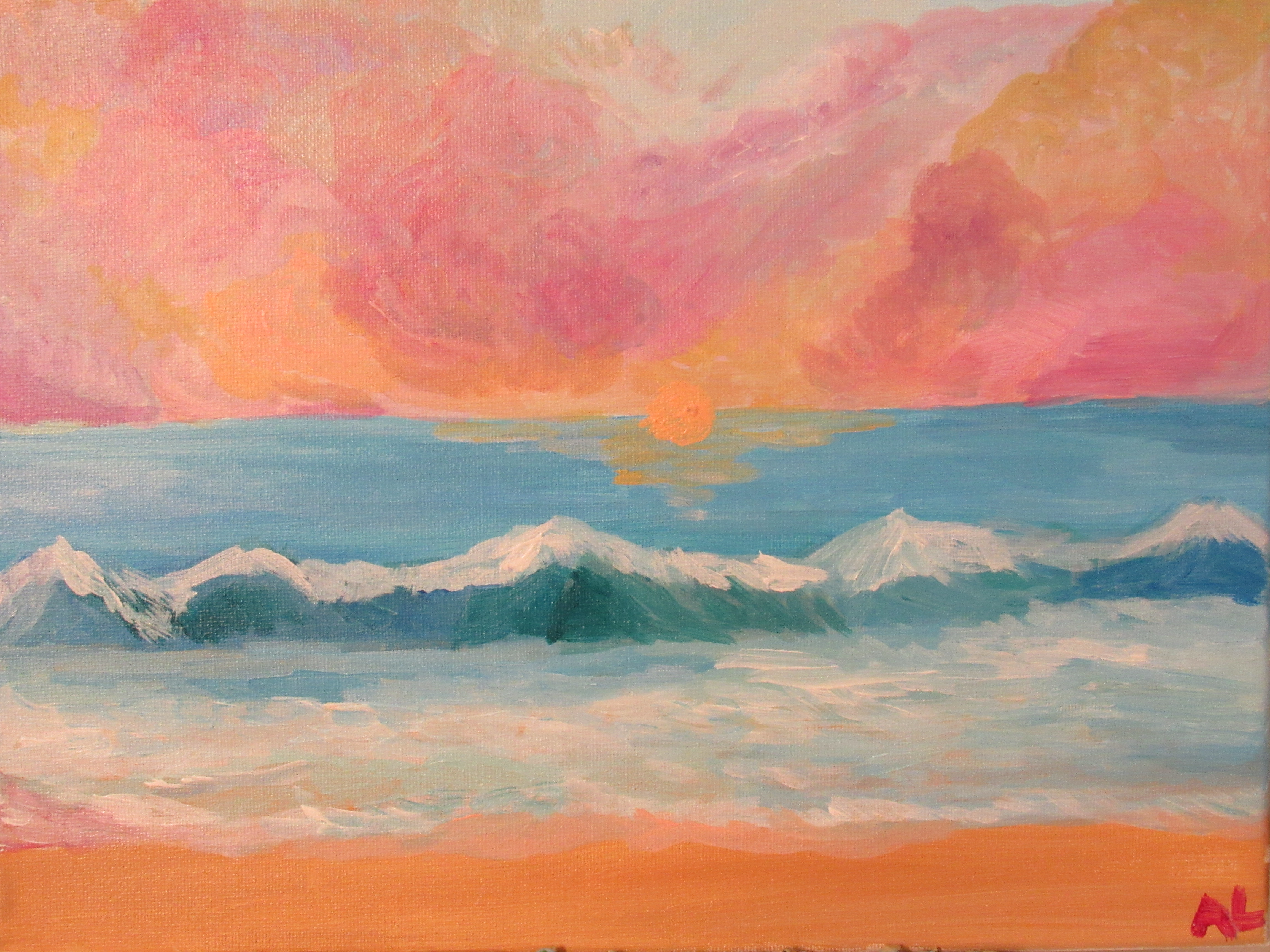
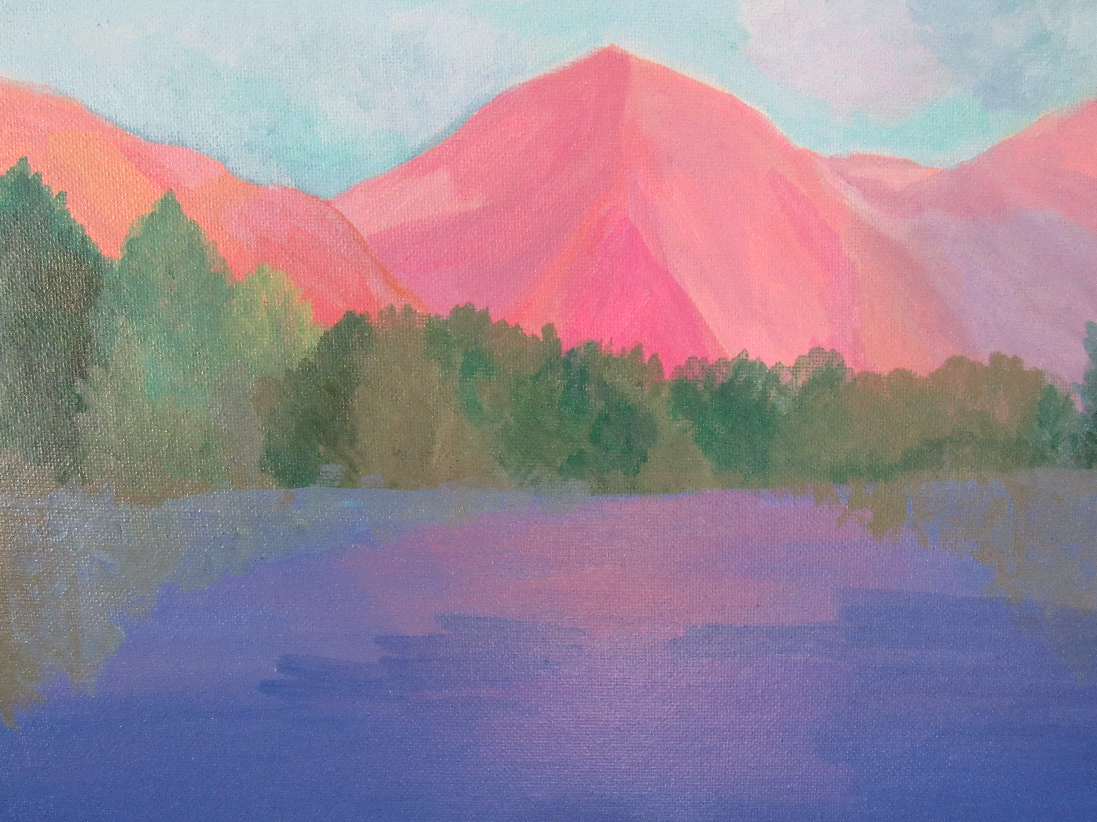
Next stop on Painting the National Parks – Lassen Volcanic. Located in northeastern California, Lassen Volcanic is home to steaming fumaroles, ambling meadows erupting with wildflowers, crystal mountain lakes and numerous volcanoes.
Volcanic sites like Mt. St. Helens and Yellowstone National Park have always fascinated me. As a person of faith, I see it as a natural display of how even the most volatile situations an yield a resilient beauty. The geology behind parks like Lassen and Yellowstone dare us to wonder and to also recognize our human limits. Nature is a dangerous beauty – wild and to be explored, but carefully.
Lassen is on my bucket list. I hope to schedule a two week California National Parks trip once COVID has calmed a bit (Omicron go away!)
NPS has a fantastic website so you can ‘virtually’ visit Lassen safely at home. Click here to explore more about Lassen
I studied many photographs of Lassen and while I would like to paint the steamy fumaroles in the future, I wanted to focus on the picturesque Manzanita Lake on the edge of sunset.
This painting was all about layering and building out soft colors to reflect the bold sunlight and the soft reflection on the water.
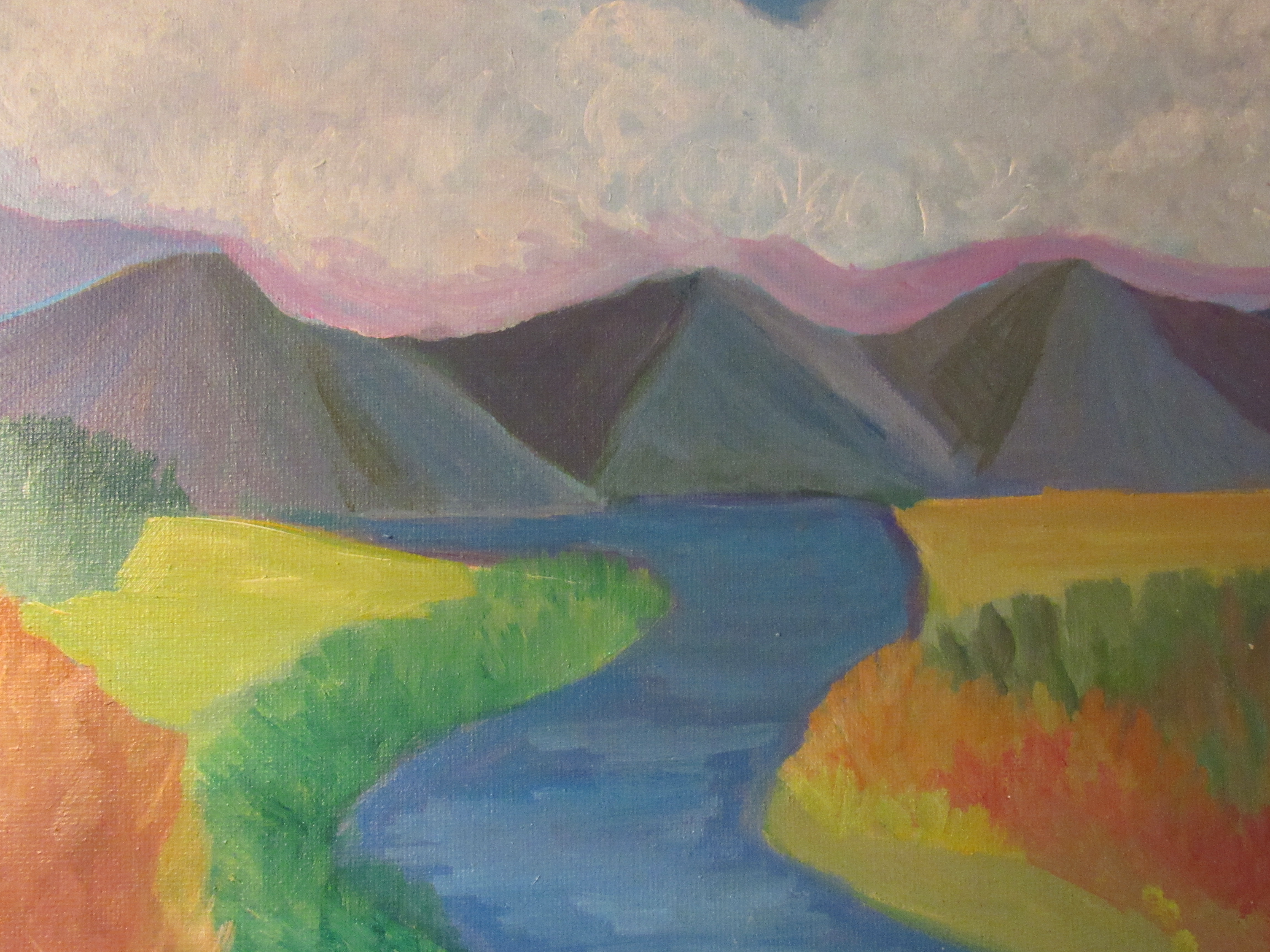
I love painting mountains because the scenery is ever changing. Depending on the weather and time of day you have a completely different masterpiece of natural art. I love playing with colors and mountains have a depth and mystery that the artist in me loves to explore.