
As I launch my new retail website on adelelassiterart.com (originals and gallery prints) and print on demand site (for mugs, puzzles, totes and more!) I’m excited to debut the first pieces in my new Chasing Impressionism Series…
As an artist I don’t ascribe to one specific style and enjoy learning and growing in my craft across boundaries of ‘style.’
That being said, a part of my heart is love with Impressionism – the bold and bright colors, use of innovative value and perspective – it makes the soul feel alive.
I was recently laid off of my ‘day job’ in software sales and find painting impressionistic scenes to be healing and provide hope in the storm.
I decided to dedicate an entire series to Impressionism. Many of these works are inspired by the talents of my favorite Impressionist and Post-Impressionistic artists like Monet, Hassam, Cezanne, Van Gogh and more…
The original paintings are for sale on adelelassiterart.com…I’m also excited about the print on demand collection because…
- Impressionism’s colors are idea for prints and fabrics
- Many of my clients don’t have wall space for additional art, but do enjoy a notebook with my art on the cover or a small print for their desktop…
Painting Impressionism…
I was careful to sit and study the art of Monet, Bonnard, Van Gogh and others in detail during my various museum travels. Seeing the art in person helps to learn how artists like Monet were able to capture the light and movement in a scene through brushwork. I can take the lessons from these artists to inspire my own artistic vision on the canvas.
My process:
Many are surprised to learn how long it takes to paint in the Impressionism style. It can appear fluid and effortless to the eye as if it was done ‘in the moment’ as an impression – which at times it is…but truth be told painting in this style takes skill and patience.
The colors need to be properly layered to tell the story and ensure the image shines, but does not blind you with color and imagery.
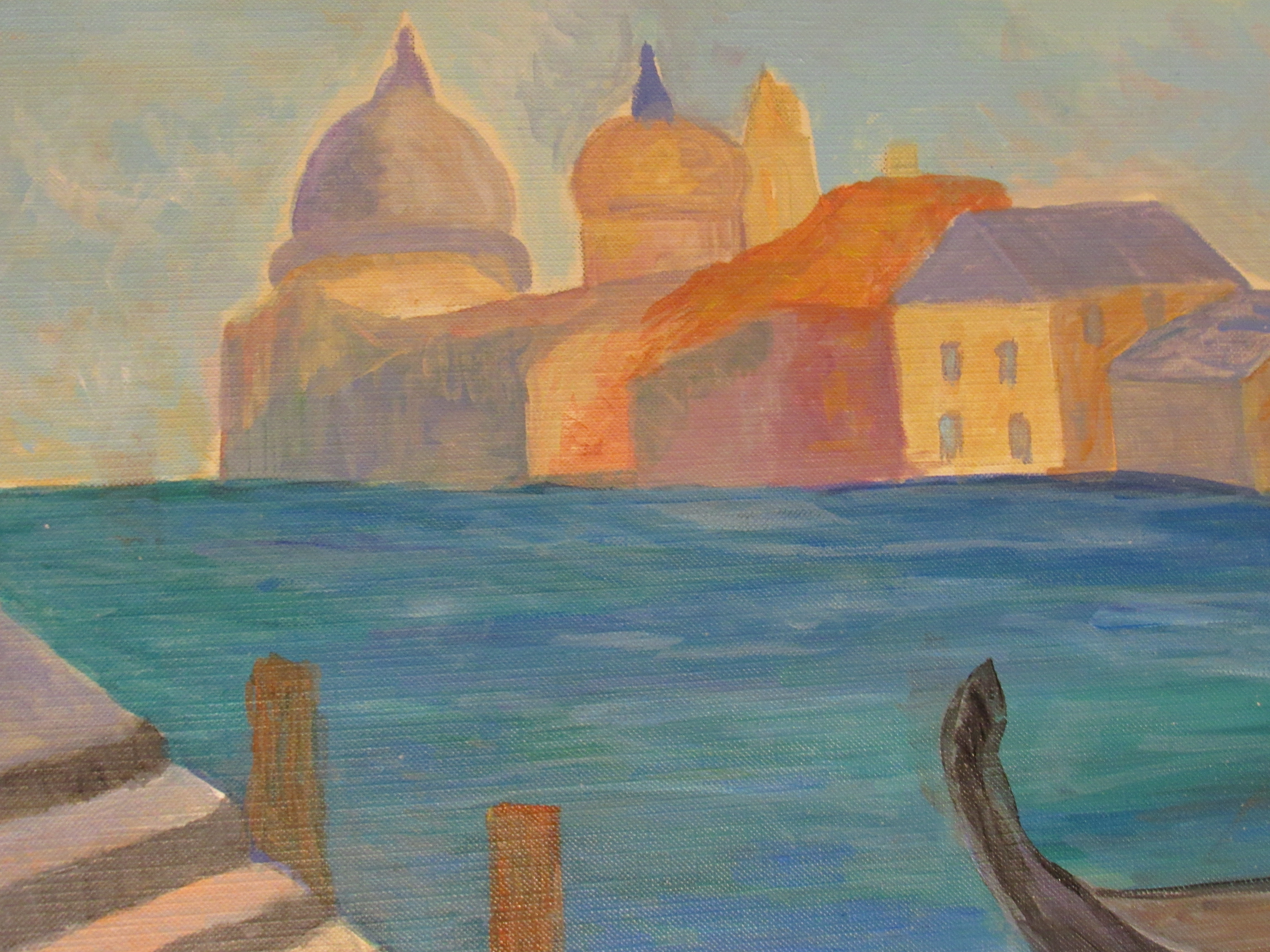
This painting is inspired by a trip I took to Venice – I realized painting the detail of buildings like St. Mark’s Basilica on canvas paper would be difficult and not capture the essence of the city I wanted to convey. I leaned into Monet’s paintings from his one trip to Venice and created my own Venetian dream.
The prints are available here.

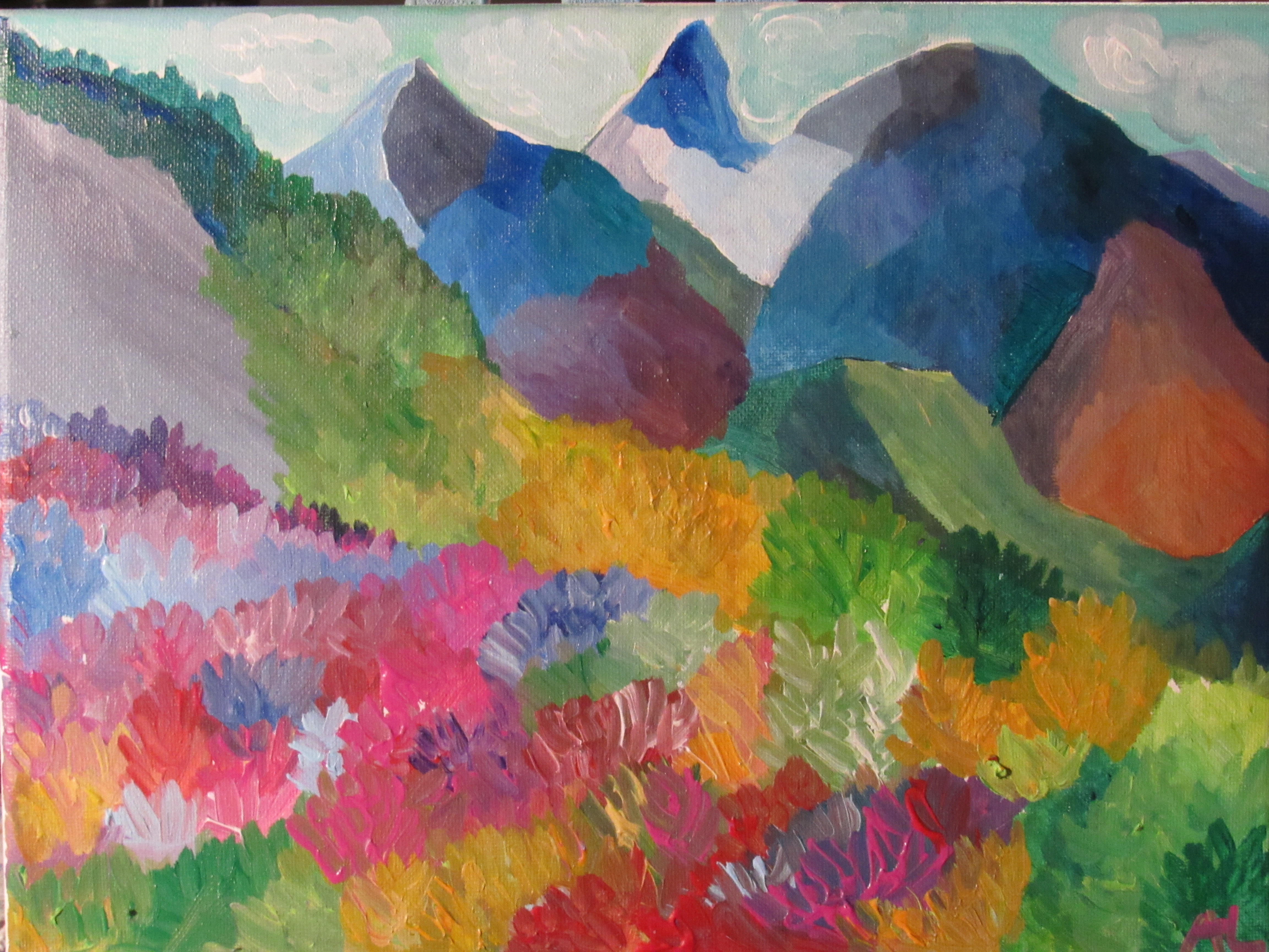
This painting – ‘Chasing Color’ inspired the collection. I studied Bonnard and Monet to create my whimsical vision. Original and prints available on adelelassiterart.com
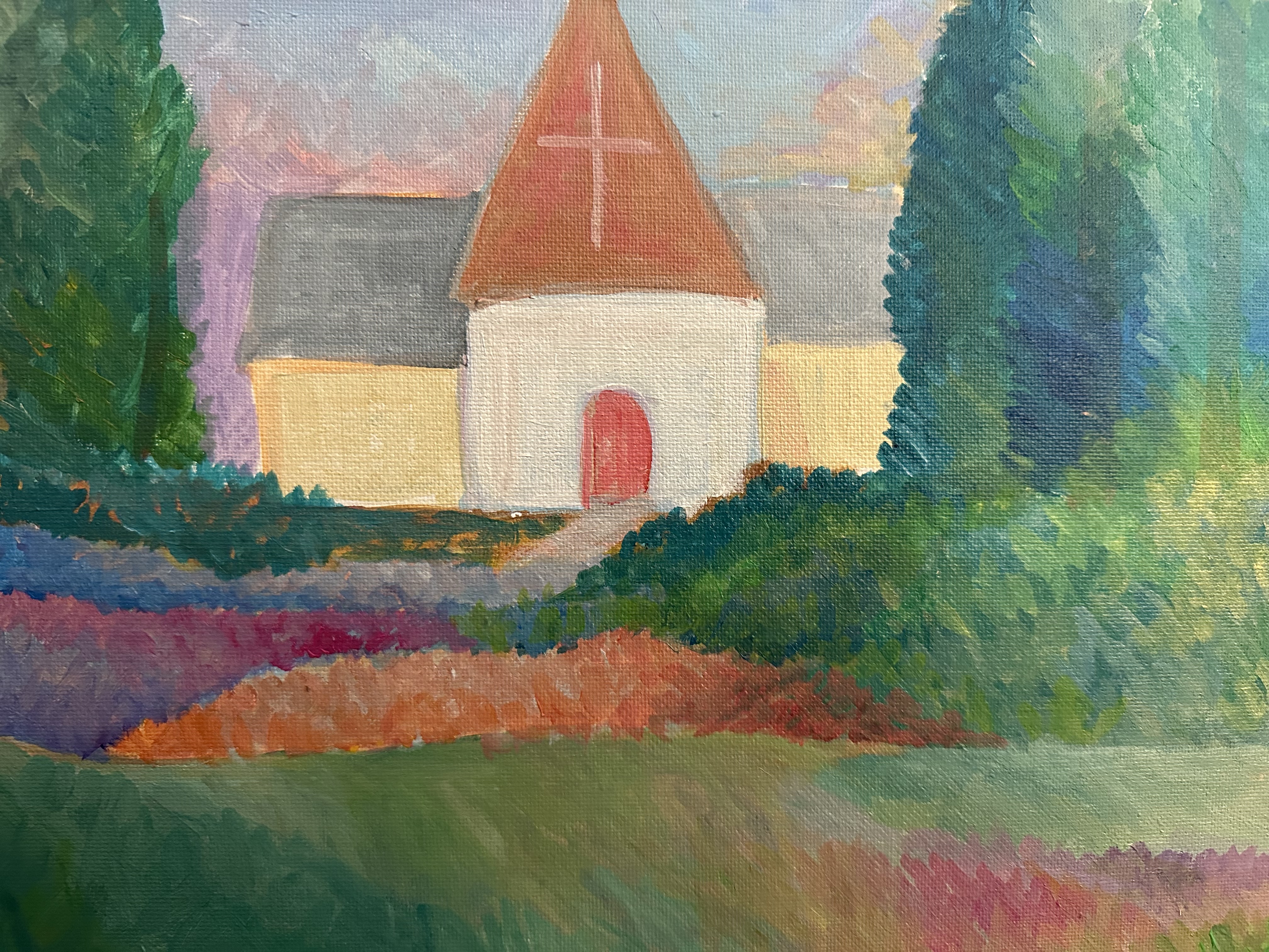
This painting is modeled after one of my favorite artists – Cezanne! (also my cat’s name) It is not meant to be perfect, but instead capture the light, shadow and color of a landscape. Purchase here.
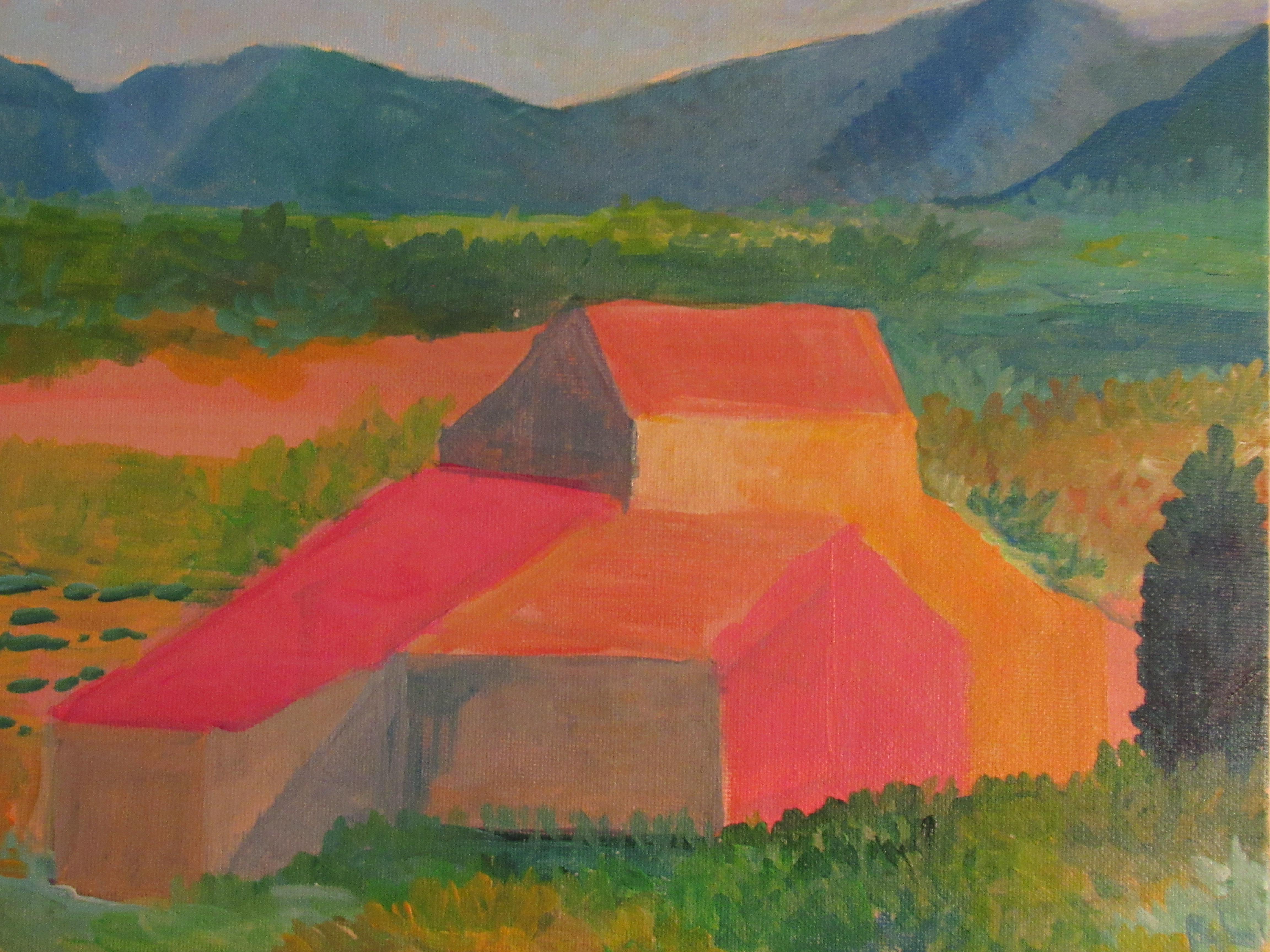
I also have leaned into Impressionism in this work, where I studied the brushstrokes of Pissarro (his field worker paintings) and developed my own brush style as well.
I look forward to continuing this and my National Parks Collection throughout the spring.
In other news:
- I am going to be launching a podcast in April – Art Expeditions (part of my American Nomad Traveler series) – and will dive into the best of art museums and art history. Looking forward to it!
I ask that you please consider purchasing my art. I am leaning into it as my main career right now and every sale makes a difference.
God bless YOU